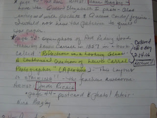
 One of my favorite books is from Stampington and is called True Colors. It features these artists: Lynne Perrella, Sarah Fishburn, Teesha Moore, Marylinn Kelly, Linn C. Jacobs, Nina Bagley, Michelle Ward, Anne Bagby, Karen Michel, Monica Riffe, Lisa Hoffman, Claudine Hellmuth, Lisa Renner, Judi Riesch, and Keely Barham.
Yes, all of these artists under "one roof." I am taking this quote straight off Stampington's web site:
"Fifteen amazing artists wanted to see what they could do with a single color scheme. Each artist contributed a journal cover in her chosen palette and a page in each journal. The finished works are filled with page after page of techniques and mediums, including stamping, painting, sketching, fabric art, metalwork, transfers and layered texturing – a wide spectrum of artistry and skill."
 If you go over there, you will be able to take a peek at some of the art work. Just incredible. Absolutely beautiful works of art. I bought my copy in February 2006 and was so impressed with it I started making notes on the art work. At that time I was just venturing out into altered books and sliding away from making cards. This book opened my eyes to some of these artists for the first time. I began searching out their web pages and blogs. I was also able and lucky enough to take workshop classes with two of the artists I so admired in this book: Michelle Ward and Claudine Hellmuth. It has been such a pleasure to get to know these two artists personally. They are both very special souls.
One of my favorite books in the Colors was the Red Book. Loved Lynne Perrella's layout on page 38. I so want the stamp called "Maiden Voyage" - but it is gone and Stampington hasn't brought it back (they have been reissuing some of her discontinued stamps).... I want that stamp. I obsess about that stamp. Breathe.... I was especially moved by Judy Riesch's Red Riding Hood layout feathers and all...... it was the first time I had really paid attention to the photography of Lewis Carroll. This inspired to do my own layouts in red, a color I don't really use alone in my layouts. Using a magazine ad, I created the page "Sun-Sation." It was fun.

The next layout I created in my book is called "Color Blocked" and once again used a magazine ad, a catalogue page using a tape transfer and clip art from ArtChix.

This is just the beginning of a few posts discussing my venture into my True Colors..... buy the book! It was not only inspirational for me as an artist but also "instructional" when I looked closely at the art to figure out how it was done....... Stay safe tonight!
"I cannot believe that the inscrutable universe turns on an axis of suffering; surely the strange beauty of the world must somewhere rest on pure joy." Louis Bogan


7 comments:
Thank you Marlynn, I will!! I love any type of art book!
Hi Marlynn,
Thanks so much for the book review!
It was a life-changer for those of us lucky enough to be included in the pages and our hope is that it will continue to inspire.
Great Blog! Keep up the Creative Work!
Lisa Hoffman (Forest Floor and Aqua Exotica)
That is one of the all time very inspiring books isn't it! I adore your red pages!
I actually got to "read" the book back in 2005 (most often I glance at pages always meaning to return for a more in depth visit one day)... our son had a very serious eye accident and True Colors helped me keep watch on our boy at Children's Hospital.
Thanks for the reminder to revisit that publication M!
oxo
and the quote ... also perfect!
oxo
Wow, I am impressed with YOUR color pages. Red is your color.
I have to admit, I am probably the only person who ever read "True Colors" who was disappointed in it. I thought there would be a few techniques, how tos, etc. for the price. Instead, all I got was a bunch of angst. Seeing a bunch of pages and not knowing how they were created was pretty frustrating, since I too got this book in 2004, when I was still learning how to do art.
I'll also admit I can appreciate it more now, but when I first got it, I was not at all impressed. Amazing what different people take away from a book.
This book is a favorite of mine, too. I tend to use a darker palette and admire the work of Nina Bagley -- however, I appreciate bright colors when others use them. (In fact, my kitchen is done in the colors (and tile work) of countries we've visited and enjoyed -- Italy, France, Greece, Mexico. Bright colors!) TRUE COLORS is such an inspiration. It's one of those books I pull down to revisit often.
Oh my gosh, this is one of my fav books of all time, love it. So inspiring.
Debby
Post a Comment